


  |

GPX's 3rd Anniversary [Party], And Valentine's Day |
 Feb 24 2012, 05:47 AM Feb 24 2012, 05:47 AM
Post
#601
|
|
 Pokémon Trainer  Group: Members Posts: 55 Joined: 14-May 10 Member No.: 96 385 Favorites |
^^^^This.
Second layout looks great and I like the way the blonde gal looked in the first layout - her eyes and face looking at you smiling is really sweet. --------------------       Fun Stuff (click to show) |
 |
 
|


|
Feb 24 2012, 08:13 AM
Post
#602
|
|
 Pokémon Trainer  Group: +Donors Posts: 19 Joined: 14-November 11 From: My room :) Member No.: 153 978 Precious <3 |
Wow, it's much better this way
 I was okay with the first version but this one is great. Thanks for the update. ^^ This post has been edited by Chiiyo: Feb 24 2012, 08:14 AM --------------------  The bird filled the sky and soared through my thoughts.                         ♣ Treasure ♣ (click to show) |
|
|
|


|
Feb 24 2012, 08:17 AM
Post
#603
|
|
 [PAPER INTENSIFIES]  Group: +Donors Posts: 492 Joined: 14-December 09 From: Portland, Ore. Member No.: 76 425 Fithos Team Delta |
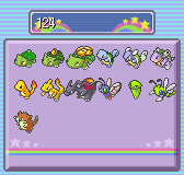
Oh yes, fantastic. I'm glad the shelter and text block were switched, and I am really happy to see the addition of the little info tab detailing the remaining number of grabs and species types.
And thank you to the admins for listening to our feedback! -------------------- |
|
|
|


|
Feb 24 2012, 08:22 AM
Post
#604
|
|
|
can u not Group: +Donors Posts: 121 Joined: 7-March 10 From: uhh Member No.: 88 119 nyoom |
Thank you for taking our suggestions into account, it looks much better and convenient now. The only thing that still bothers me is the girl's eyes, she looks possessed.. or idk, maybe really sleepy/exhausted. At first she was staring into my soul like a zombie, now she's staring somewhere else like a zombie..
--------------------  |
|
|
|

|
Feb 24 2012, 08:28 AM
Post
#605
|
|
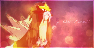
 I'm under yer bed instigating night terrors >8)  Group: +Donors Posts: 56 Joined: 2-April 10 From: The District, USA (DC) Member No.: 91 319 PENI- Uh.. SPACE ENVY |
Oooh, they have names :0 (or perhaps they always had names and I'm just oblivious?)
-- Oh, and, yesss, thanks so much for switching the egg part of the shelter to the top. Much better :'D -------------------- Call me Ronnie (or Ronnster) Please :> NOTICE: I'm not that active at this moment so I will be uber slow with PMs and might not clickback or whatever. Maybe I'll be back in full force someday... like for the SWSH... I don't wanna miss out on the prize... <.<
  KotRT (click to show) Maybe I'm just a dreamer (click to show) credits and personal notice (click to show)       |
|
|
|


|
Feb 24 2012, 09:11 AM
Post
#606
|
|
 Humans taste like chicken  Group: Members Posts: 112 Joined: 27-September 09 From: R'lyeh Member No.: 65 358 The pokes |
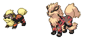
New page looks a lot better but Alex eyes are bothering me as well now , oh and why the hell is Thomas shirtless ?
-------------------- I will no longer make a new signature , enjoy the freaking monkey >C        |
|
|
|
|
Feb 24 2012, 09:36 AM
Post
#607
|
|
 I'm different...  Group: +Donors Posts: 491 Joined: 6-May 09 From: Aperture Laboratories Member No.: 20 006 Active Squad |
The eyes are anatomically correct now - that was the complaint before, and that was fixed. I'm not changing their pose or shifting the head to make them face you, because that'd require completely redrawing pieces of the image. The sleepy look is purposeful, the eyes are positioned so as to be looking at the viewer. ...And the guy isn't wearing a shirt because he doesn't want to wear a shirt.
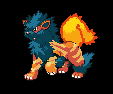
The first time I understood the anatomy complaints because they were valid, but this time it's nitpicking. Unless you can pinpoint why the new position of the eyes is anatomically incorrect, that is. Edit: tl;dr what I'm saying is the art was reviewed because it was anatomically incorrect, not because people didn't like how it looked. You don't have to like how it looks, or the characters' expressions, clothes (or lack thereof) or anything about them, really. I'm not changing the picture again, however, unless there is a structural problem with it like the first time. FTR, I also did the Cypress image, and a third image that's yet to be revealed. I made fixes to all three after the initial complaints - one has a structural problem that would require complete redrawing to fix, so unless it bothers people too much I'll leave it alone. This post has been edited by Different Turret: Feb 24 2012, 10:04 AM --------------------   |
|
|
|

|
Feb 24 2012, 11:01 AM
Post
#608
|
|
 Well, I wish I'd wished you well  Group: +Donors Posts: 1 351 Joined: 19-February 09 From: Backstage Member No.: 4 143 Let Us In |
I like their names.
 The information being positioned at the bottom is a big help, as others have said. The information being positioned at the bottom is a big help, as others have said.There's nothing wrong with the pictures. :/ Like, at all. -------------------- |
|
|
|


|
Feb 24 2012, 11:04 AM
Post
#609
|
|
 Pokémon Trainer  Group: +Donors Posts: 59 Joined: 10-April 09 From: England Member No.: 9 930 Favourites |
QUOTE(Different Turret @ Feb 24 2012, 02:36 PM)  The eyes are anatomically correct now - that was the complaint before, and that was fixed. I'm not changing their pose or shifting the head to make them face you, because that'd require completely redrawing pieces of the image. The sleepy look is purposeful, the eyes are positioned so as to be looking at the viewer. ...And the guy isn't wearing a shirt because he doesn't want to wear a shirt. The first time I understood the anatomy complaints because they were valid, but this time it's nitpicking. Unless you can pinpoint why the new position of the eyes is anatomically incorrect, that is. Edit: tl;dr what I'm saying is the art was reviewed because it was anatomically incorrect, not because people didn't like how it looked. You don't have to like how it looks, or the characters' expressions, clothes (or lack thereof) or anything about them, really. I'm not changing the picture again, however, unless there is a structural problem with it like the first time. FTR, I also did the Cypress image, and a third image that's yet to be revealed. I made fixes to all three after the initial complaints - one has a structural problem that would require complete redrawing to fix, so unless it bothers people too much I'll leave it alone. Whilst I really appreciate what you're saying (I seriously hate editing art when I've got it to where I consider it finished), I do think that the girl's right eye (her right) needs a highlight. I know, the shadow from her brow and nose would probably mean there wouldn't be a reflex there, if we're getting pedantic. But it does make her right eye look a bit distant and cold looking. I think just one small highlight there would just finish it off. I get that she has a sleepy look and I get that you're trying to be accurate- her expression itself is fine. There's no problem with your grasp on anatomy, just that only one of her eyes looks so cold and it's offputting! But with an anime-like style, I think you can bend the rules a little, right? It'd shut people up, in any case! Personally, though, I think all the art looks wonderful. What you've done is gorgeous. I like the kinds of colours you use and how you do your shading. Thank you for the nice art! This post has been edited by Mornington Crescent: Feb 24 2012, 11:07 AM --------------------  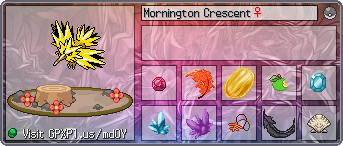 |
|
|
|
|
Feb 24 2012, 11:12 AM
Post
#610
|
|
 Elite Four  Group: +Donors Posts: 993 Joined: 9-June 09 Member No.: 32 330 Active Squad |
QUOTE(Slade Wilson @ Feb 24 2012, 03:03 AM) QUOTE(The Yatagarasu @ Feb 23 2012, 11:13 PM) Guess I'm one of the few who was fine with the way it was the first time. See, I was perfectly fine with the art. I saw no issues with it. The placement of the info and egg box was the only problem I saw. Everyone except newbies knows what the shelter is for, so having the info at the top was annoying to look at I was actually referring to the placement of the info box and egg box though I was fine with the art as well. This post has been edited by The Yatagarasu: Feb 24 2012, 11:14 AM --------------------  |
|
|
|
|
Feb 24 2012, 11:36 AM
Post
#611
|
|
 Pokémon Trainer  Group: +Donors Posts: 23 Joined: 29-August 10 From: UK Member No.: 112 020 Active Squad |
Personally i think the images look perfectly fine. You know for the sake of a little bit of shadow or an expression i think its really not worth re-drawing an image especially for characters which run the daycare and shelter. Images look great, the page layout is much better with the egg space being higher on the page, does have the feeling of importance now, where as before it seemed to have lost its standout-ish-ness.
With any luck other pages like the Battle tower will get this treatment; obviously i realise the whole site is getting a revamp, ut i mean with the images etc. Hopefully the GPX+ Gym leaders will be incorporated into the BT and each member would/could have its own NPC image. Hows the progress coming along anyways BB? -------------------- |
|
|
|


|
Feb 24 2012, 11:52 AM
Post
#612
|
|
 Poliwag Awesome Dude  Group: +Donors Posts: 138 Joined: 29-April 09 From: Ruling the world with Poliwag~ Member No.: 17 353 Poliwag! |
I like the adjustments to the Shelter page that have been made. Makes everything look more orderly and in the right place, good job!
--------------------     Looking for a small, close, friendly community where you can hang out, talk about Pokémon and anything, and have fun? Check out Poliwager Forums! |
|
|
|

|
Feb 24 2012, 12:20 PM
Post
#613
|
|
|
Pokémon Trainer  Group: +Donors Posts: 0 Joined: 30-August 10 Member No.: 112 107 Active Squad |
the shelter update looks alot better than the original in my opinion as others have said
@different Turret, i think the graphics are fantastic as they are and don't need changing. -------------------- 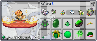 |
|
|
|
|
Feb 24 2012, 12:20 PM
Post
#614
|
|
|
The Blue Comet  Group: Global Moderators Posts: 1 949 Joined: 17-April 10 From: Ireland Member No.: 93 314 snappers |
Okay, I'm liking the new Shelter layout and the way the important info is presented alone (though perhaps the items should be attached to that box? There's space up there). I never saw any problems with the image the first time (guess I'm not much of an art student =P) but I do agree now that there is something off about her eye. I do understand it's a lot of work to fix a little thing, and I wonder why if you're complaining about this why you never complained about this:
 LOOK AT HER EYE. (though I do, overall, like that image )EDIT: oh, and I like the new names! though both are gender-ambiguous (androgynous?) to a degree =P This post has been edited by Cycloneblaze: Feb 24 2012, 12:21 PM -------------------- |
|
|
|


|
Feb 24 2012, 12:25 PM
Post
#615
|
|
|
Pokémon Trainer  Group: +Donors Posts: 5 Joined: 2-February 11 From: New York City Member No.: 130 019 Crystal Party |
I actually noticed that the change was an anatomical one, DT.
I'm very happy you moved Thomas's mouth over. That was bugging me to no end in the first version, but I refused to nitpick your beautiful art. Just....thank you XD As for the new Alex...I just think she looks like Paris Hilton now...which is pretty funny XD And as for everything else, really appreciate the orientation change and that little info box. Thank you for listening to feedback! -------------------- ★ ★ ★ Keeper of The Shiny Knights List ★ ★ ★     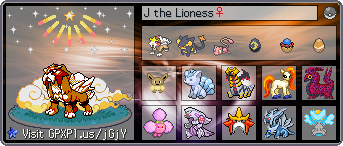 Art / Groups / Support / Banners (click to show) ~~TRINKET COLLECTIONS~~ (click to show) Credits (click to show) |
|
|
|


 (13)
(13)  (33)
(33)  (15)
(15)  (7)
(7)  (10)
(10)  (32)
(32)
|
Feb 24 2012, 12:31 PM
Post
#616
|
|
|
I'm different... Group: +Donors Posts: 491 Joined: 6-May 09 From: Aperture Laboratories Member No.: 20 006 Active Squad |
QUOTE(Mornington Crescent @ Feb 24 2012, 02:04 PM) QUOTE(Different Turret @ Feb 24 2012, 02:36 PM) The eyes are anatomically correct now - that was the complaint before, and that was fixed. I'm not changing their pose or shifting the head to make them face you, because that'd require completely redrawing pieces of the image. The sleepy look is purposeful, the eyes are positioned so as to be looking at the viewer. ...And the guy isn't wearing a shirt because he doesn't want to wear a shirt. The first time I understood the anatomy complaints because they were valid, but this time it's nitpicking. Unless you can pinpoint why the new position of the eyes is anatomically incorrect, that is. Edit: tl;dr what I'm saying is the art was reviewed because it was anatomically incorrect, not because people didn't like how it looked. You don't have to like how it looks, or the characters' expressions, clothes (or lack thereof) or anything about them, really. I'm not changing the picture again, however, unless there is a structural problem with it like the first time. FTR, I also did the Cypress image, and a third image that's yet to be revealed. I made fixes to all three after the initial complaints - one has a structural problem that would require complete redrawing to fix, so unless it bothers people too much I'll leave it alone. Whilst I really appreciate what you're saying (I seriously hate editing art when I've got it to where I consider it finished), I do think that the girl's right eye (her right) needs a highlight. I know, the shadow from her brow and nose would probably mean there wouldn't be a reflex there, if we're getting pedantic. But it does make her right eye look a bit distant and cold looking. I think just one small highlight there would just finish it off. I get that she has a sleepy look and I get that you're trying to be accurate- her expression itself is fine. There's no problem with your grasp on anatomy, just that only one of her eyes looks so cold and it's offputting! But with an anime-like style, I think you can bend the rules a little, right? It'd shut people up, in any case! Personally, though, I think all the art looks wonderful. What you've done is gorgeous. I like the kinds of colours you use and how you do your shading. Thank you for the nice art! It's not that I hate editing art when I've got it to where I consider it finished - if there is something I think and/or agree needs fixing, I will fix it. The eye actually does have a highlight - it doesn't go over the pupil by more than a pixel (does go over the iris), but it's there. You may notice the outline of the eye doesn't close completely (the side on your left) - that's where the highlight is. I have all the eye highlights on a separate layer on top of the lineart and I assure you, the highlight is there. I can push the highlight further right, that's not a problem. I don't mind editing the artwork, like I said. I do, however, mind the sense of entitlement behind some of the comments. Keep in mind that a professional freelancer charges extra when asked to change things on finished/previously approved pieces. When editing this the other day I went over the image with Zerxer multiple times, asked if there was anything else or if it was good. The edits (which were a lot more trouble than they may sound - I also fixed other anatomy issues while at it) were approved as far as I could tell, so being told now that it was better the way it was before - after fixing it because of complaints that it wasn't right - is pretty grating. I think your comment addressed the issue politely, mind. That kind of feedback, I don't mind. It's just that earlier what I saw was basically "this looks so weird" and when fixed "ew it looked better before". Not from everyone, of course, and positive feedback is awesome, but negative feedback is how things get improved, obviously. -------------------- |
|
|
|
|
Feb 24 2012, 12:57 PM
Post
#617
|
|
 *slowly rising*  Group: Members Posts: 1 147 Joined: 16-February 09 Member No.: 4 001 Active Squad |
I actually like her sleepy look and the fact that Thomas wears no shirt. To me little things like this add personality and some kind of depth to the characters, which is very hard when they only have a few lines and you have to "judge" them by the image alone. I myself came up with little traits for them, which I will keep to myself, because some are weird ... it's just a way for me to become "closer" to the characters
 And remember that we are talking about manga style characters here, guys, they will never be completely realist. DT's art is awesome. But I think I spotted a little something, though. I may be incorrect, but with Thomas' neck turned on one side like this, shouldn't his adam's apple (at least I think that shadow is his adam's apple) be between his SCM muscles, not beside them? I mean, shouldn't the right (his right) SCM be curved around and past the A'sA? Soo sorry, if I'm incorrect or that's not even his A'sA 
--------------------    Have you ever had this dream of falling into an endless abyss? It's funny how short our lives are, how insignificant... Have you ever had this feeling of detachment, absence, transcendence ... In the end all of those big words are nothing but loneliness. Have you ever stopped for a second to think how vast the world is, how many secrets it holds, how many will remain hidden for an eternity... And then the light flashes and suddenly the whole world crumbles around you... and you're saved. |
|
|
|

|
Feb 24 2012, 01:00 PM
Post
#618
|
|
 Cute Pokemon Lover  Group: +Donors Posts: 304 Joined: 2-April 09 From: Ohio, USA Member No.: 7 632 Can't Hug Every Cat |
Ooh I'm curious about the Fill my party! I hope it has a random egg option.
--------------------   |
|
|
|

|
Feb 24 2012, 01:00 PM
Post
#619
|
|
 Wartortle Tamer  Group: +Donors Posts: 101 Joined: 16-May 09 From: Texas, United States Member No.: 23 793 The Crew |
This update is much improved; I'm glad to see suggestions were implemented! The egg box is perfect up at the top and is, in my opinion, easier to access than the original version.
The art tweaks also look great. I love the idea of two new NPCs. Thanks y'all!
--------------------     ~Kai avatar by PurpleKecleon~  squid comin through get out the way くコ:彡 =3  AWESUM trainer portrait by Kady! |
|
|
|

|
Feb 24 2012, 01:03 PM
Post
#620
|
|
|
Pokémon Trainer  Group: Members Posts: 14 Joined: 3-February 11 Member No.: 130 176 Active Squad |
I like the redone new shelter, very easy and accessible!
Can't wait to see all these changes implemented!! I think the art is fantastic as is, when I'm in the shelter I won't be fussing over the details of the NPCs, I'm sure I'll be fussing over trying to get the right eggs in my party. --------------------  My Shinies (click to show) Arcanine and Friends (click to show) Awesome People who Create Awesome Things! (click to show) Rotating Avatar thanks to this place. |
|
|
|


|
1 User(s) are reading this topic (1 Guests and 0 Anonymous Users)
0 Members:
| Lo-Fi Version | Time is now: 18th May 2024 - 05:49 PM |

